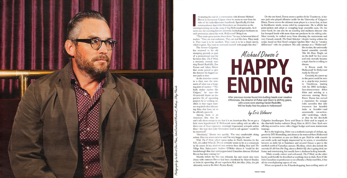
Film director Michael Dowse, photo by Ian Woo

Michael Dowse – Swerve Magazine

By Photo, Portrait
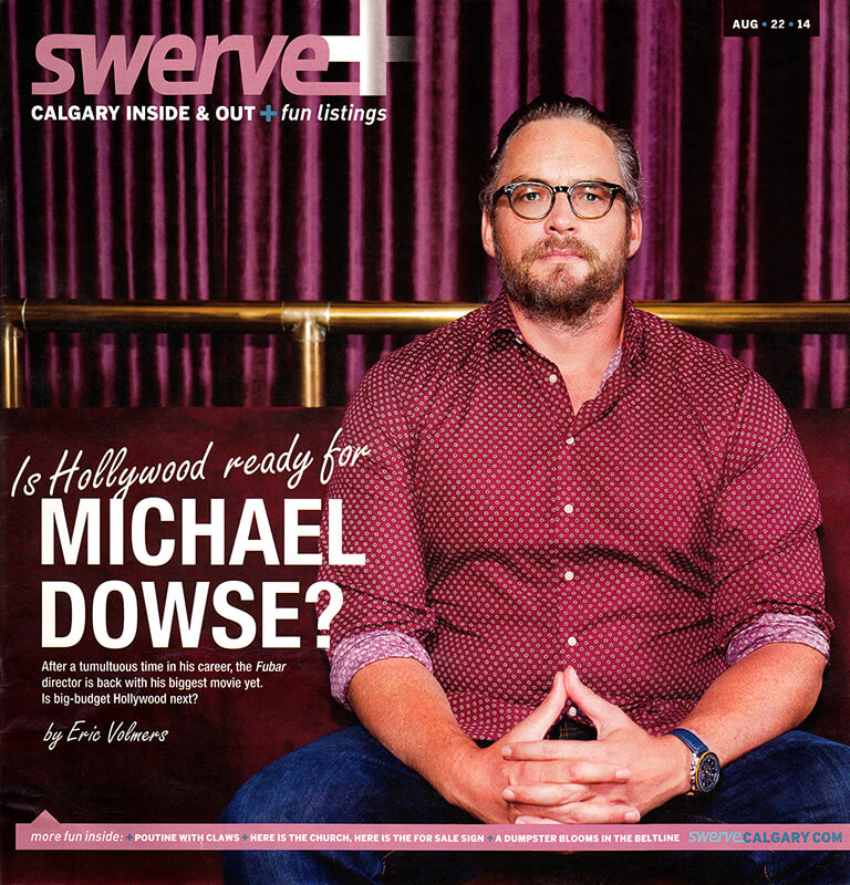
Mes photos pour l’article de couverture de Swerve Magazine (Calgary) avec le réalisateur canadien Michael Dowse, connu pour FUBAR. C’était à l’occasion de la promotion de son film « The F Word » (intitulé « What If » en dehors du Canada et du Royaume-Uni) avec Daniel Radcliffe, Zoe Kazan et Adam Driver. Il a également réalisé l’un de mes films préférés, It’s All Gone Pete Tong (dont la bande originale est incroyable).

  • Direction artistique : Brent Morrison
  • Maquillage : Sylvy Plourde
  • Lieu : Chez Plume, Hôtel InterContinental Montréal
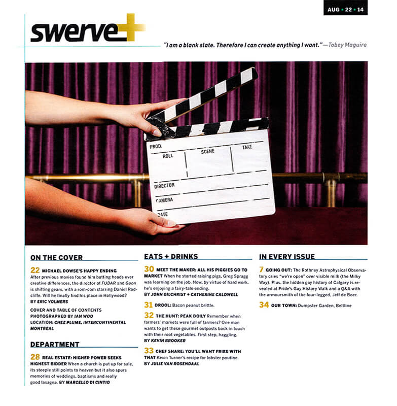
  • Claquette: merci Ariane Collman :)

My shots used for the Swerve Magazine cover story about Canadian director Michael Dowse, of FUBAR fame. This part of his promotion of The F Word (titled “What If” outside of Canada and the UK) which features Daniel Radcliffe, Zoe Kazan, and Adam Driver. He also directed one of my favourite films, It’s All Gone Pete Tong (which has an incredible soundtrack).

  • Art direction: Brent Morrison
  • Makeup: Sylvy Plourde
  • Location: Chez Plume, InterContinental Montreal Hotel
  • Movie slate: thx Ariane Collman :)

Film director Michael Dowse, photo by Ian Woo

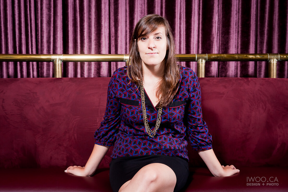
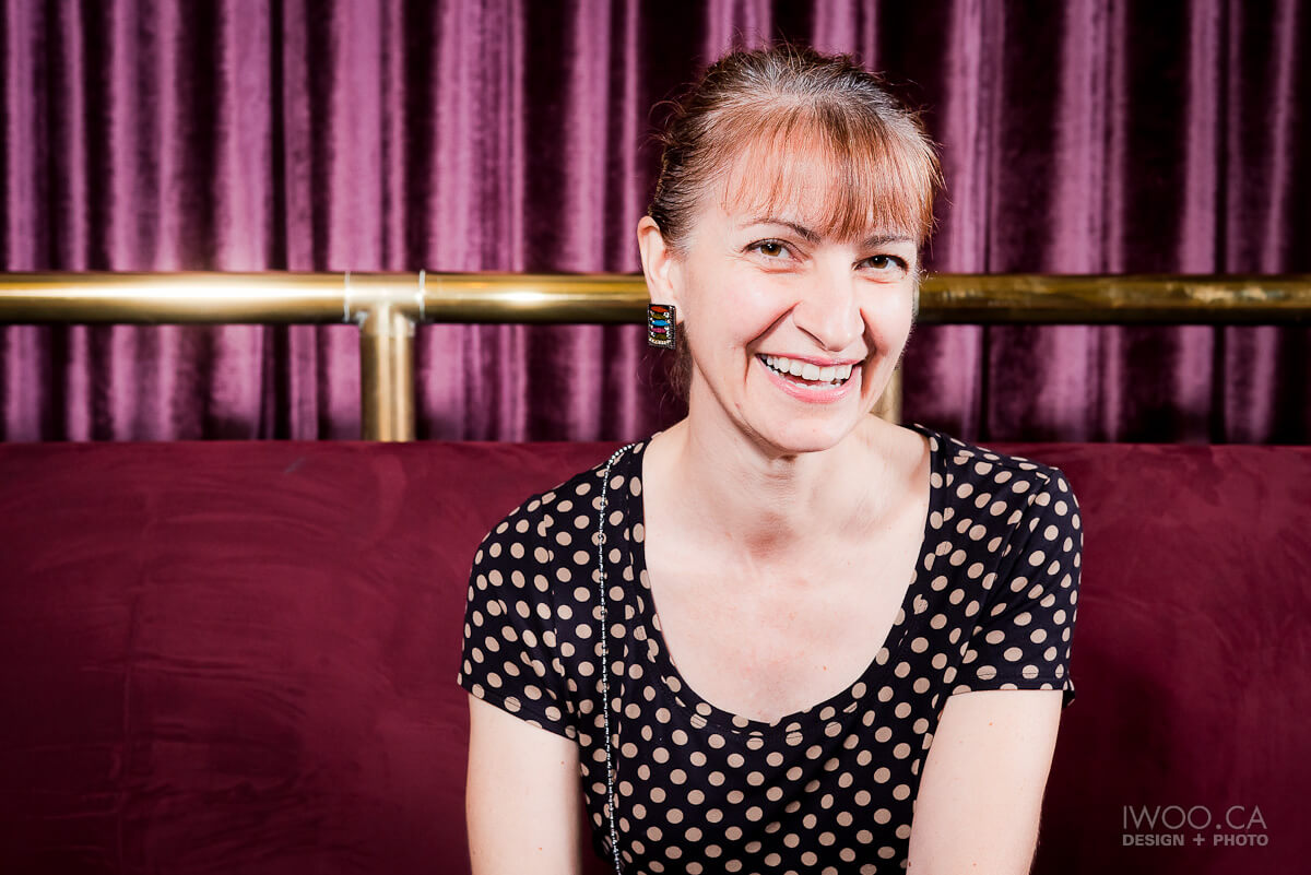
Prises refusées / Outtakes
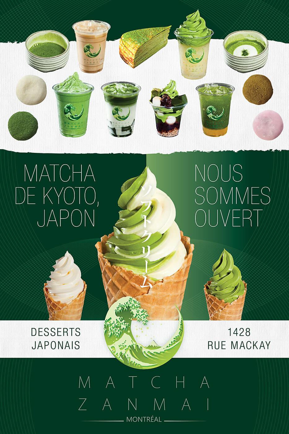
Matcha Zanmai

By Commercial, Design, Photo, Print
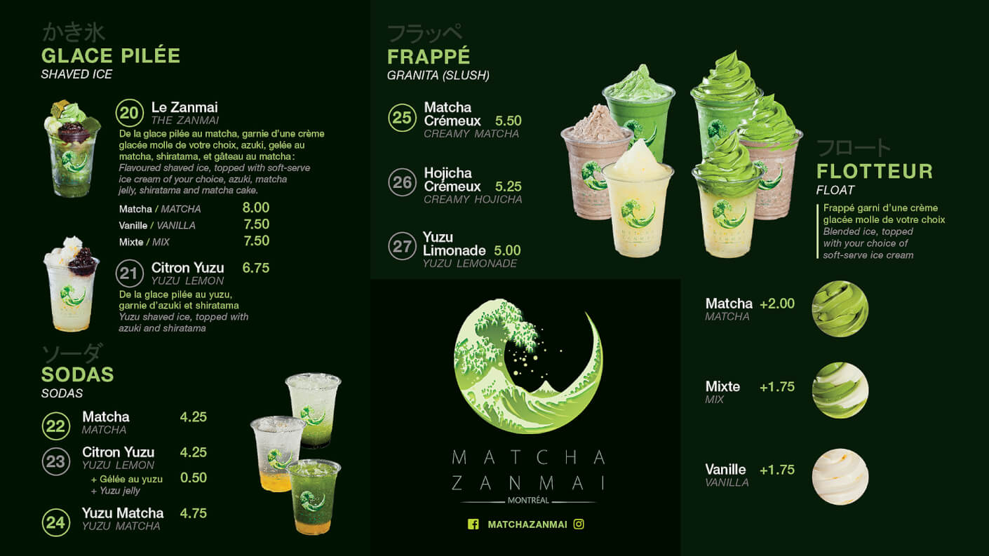
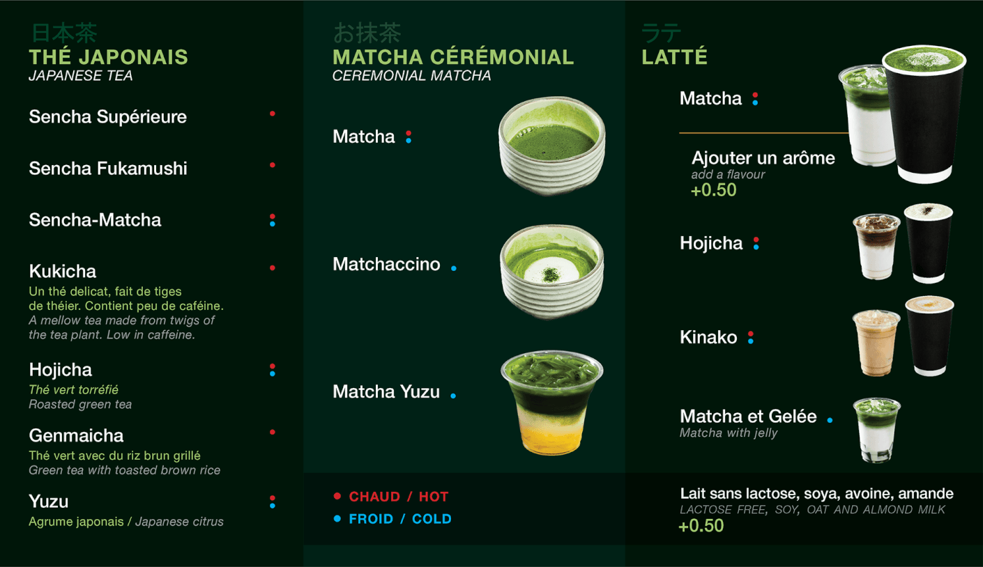
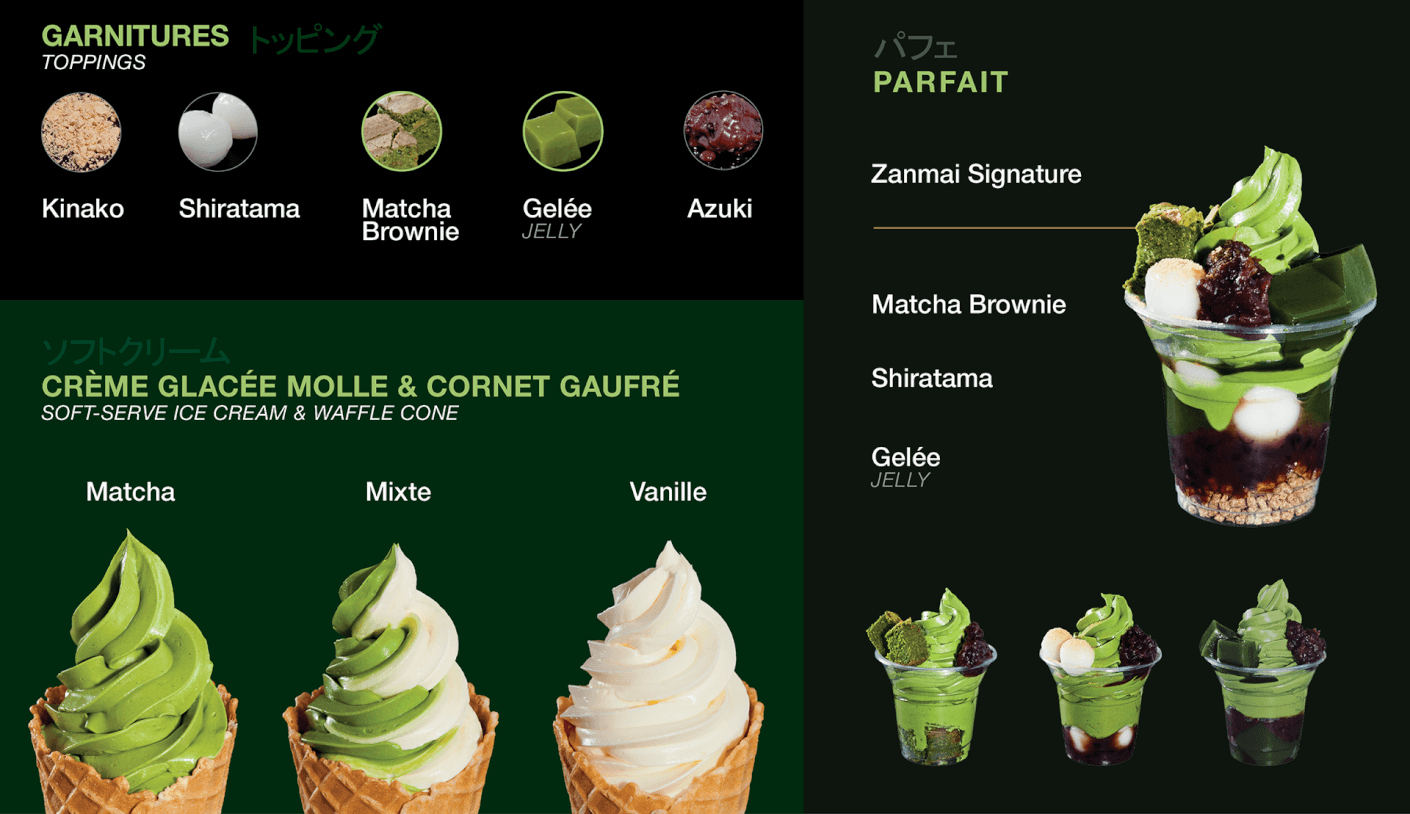
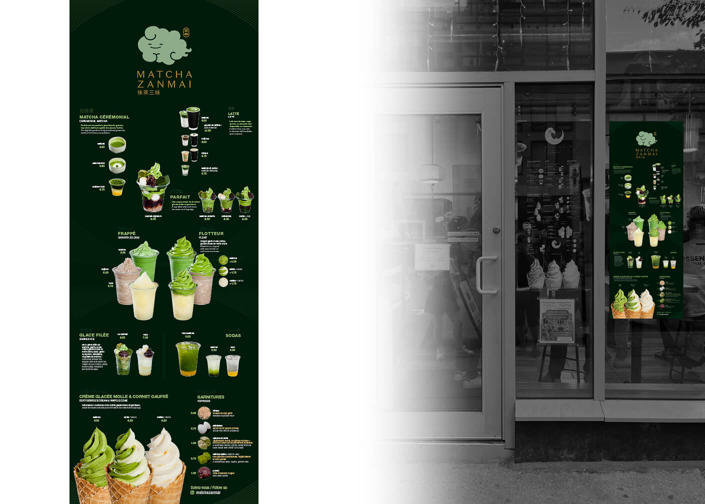
Design and photos pour Matcha Zanmai, un café qui a un focus sur les desserts japonaises fait avec du matcha.

Design and photos for Matcha Zanmai, a cafe that has a focus on Japanese desserts made with matcha.

Menu vertical pour les passants ou les personnes faisant la queue. À droite : une maquette pour montrer le menu original et la mise à jour récente pour le mettre plus lisible et agrandir les photos des produits.

Vertical window menu for those passing by in the street or waiting in line. On the right: a comparison of the original window menu versus the more recent update to improve legibility and enlarge the product photos.

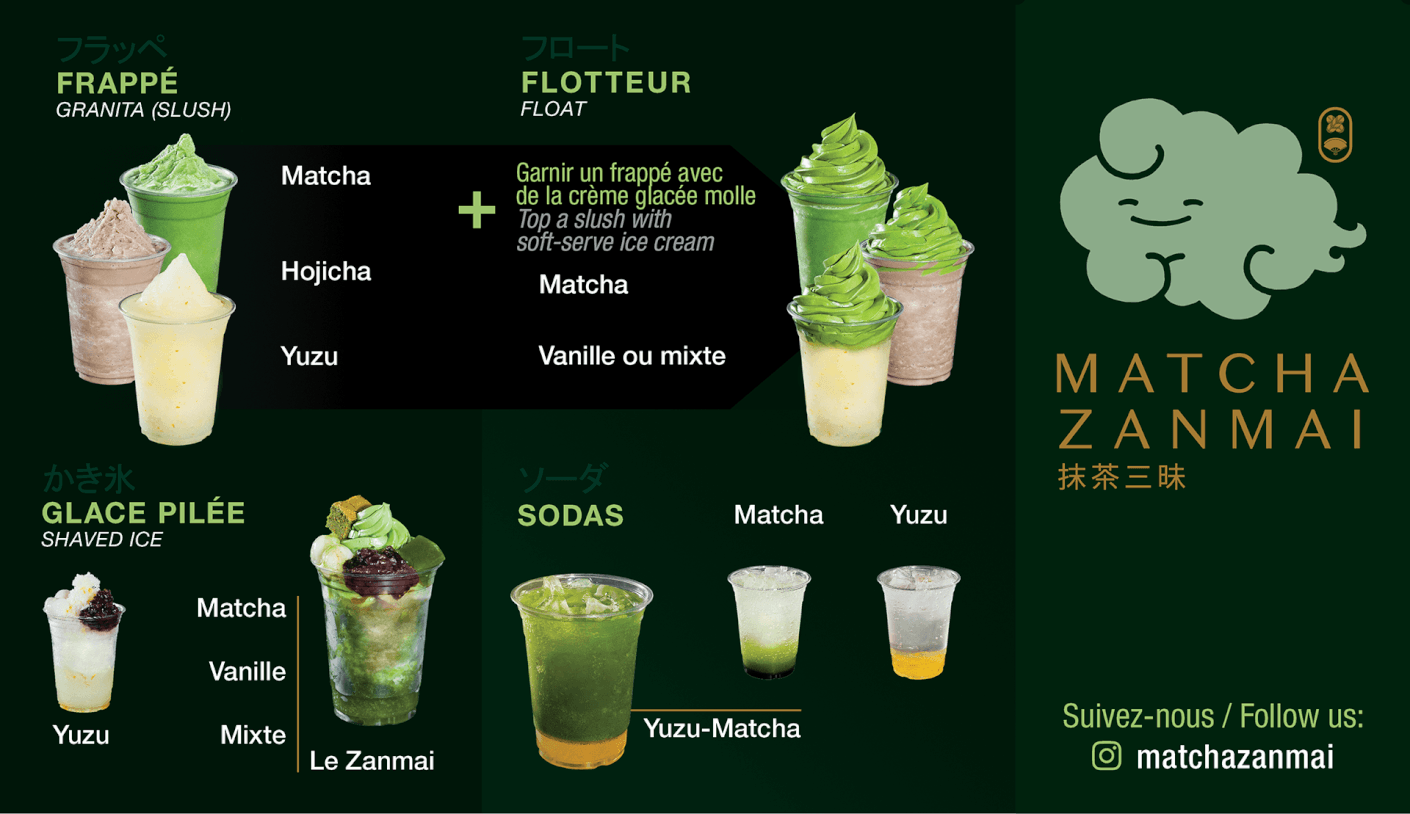
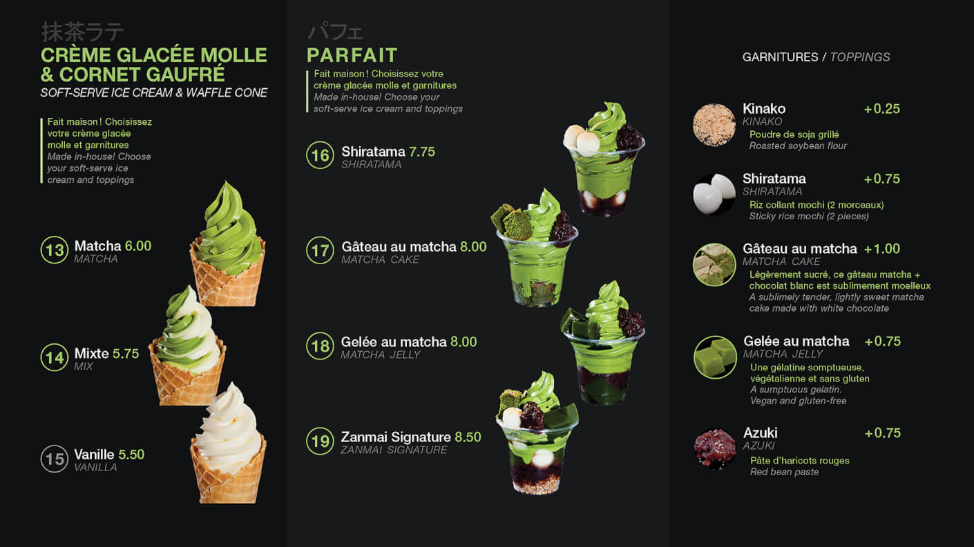
Le premier menu pour comparison. On a fait un approche plus minimaliste (en haut) quelques années apres le lancement, une fois que la majorité de clients connait très bien le matcha et les produits. Ce fut un amélioration de lisibilité sur les écrans.

The first menu for comparison. We took a more minimalist approach (above) a few years after launch, now that most customers were very familiar with matcha and other products. This resulted in improved legibility on the screens.

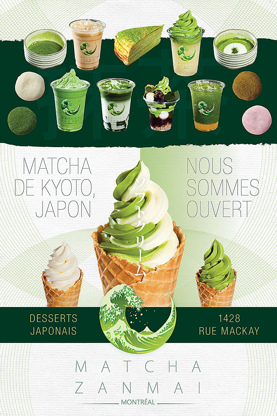
Panneau de trottoir ; même design, mais avec un fond aux couleurs inversées pour un rendu différent selon la direction d’approche dans la rue.

Sidewalk sign; the same design but with an inverted background color scheme to give it a different look depending on which direction the viewer is approaching on the street

Sakao Matcha

By Commercial, Design, Photo, Print
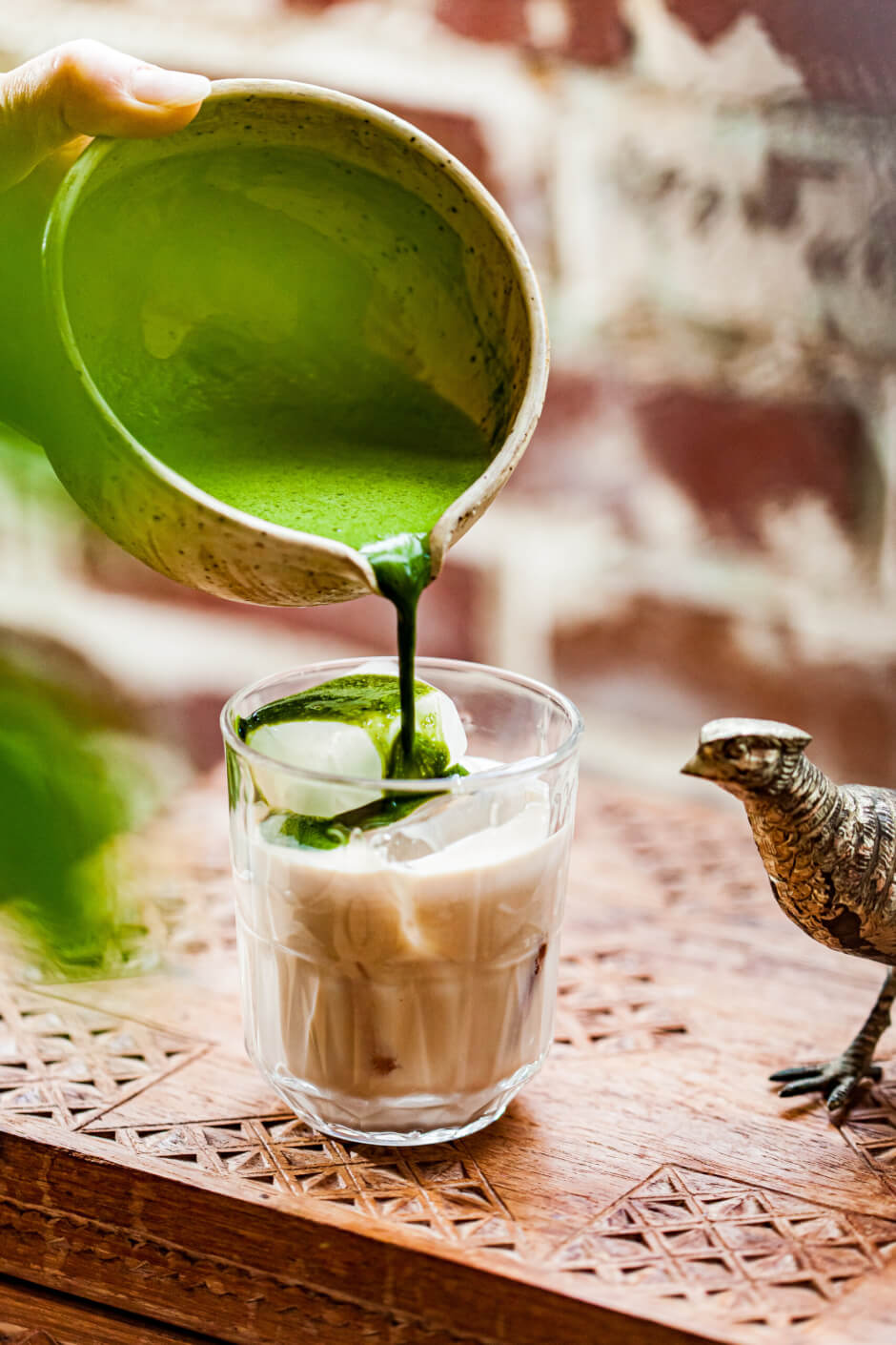
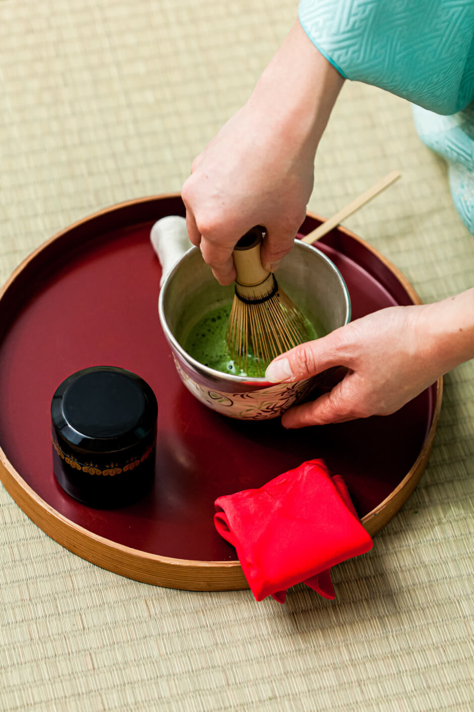
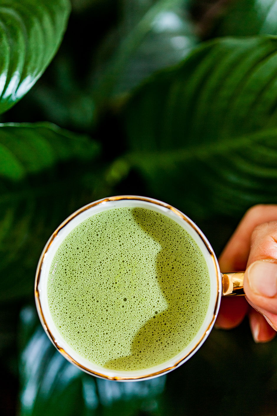
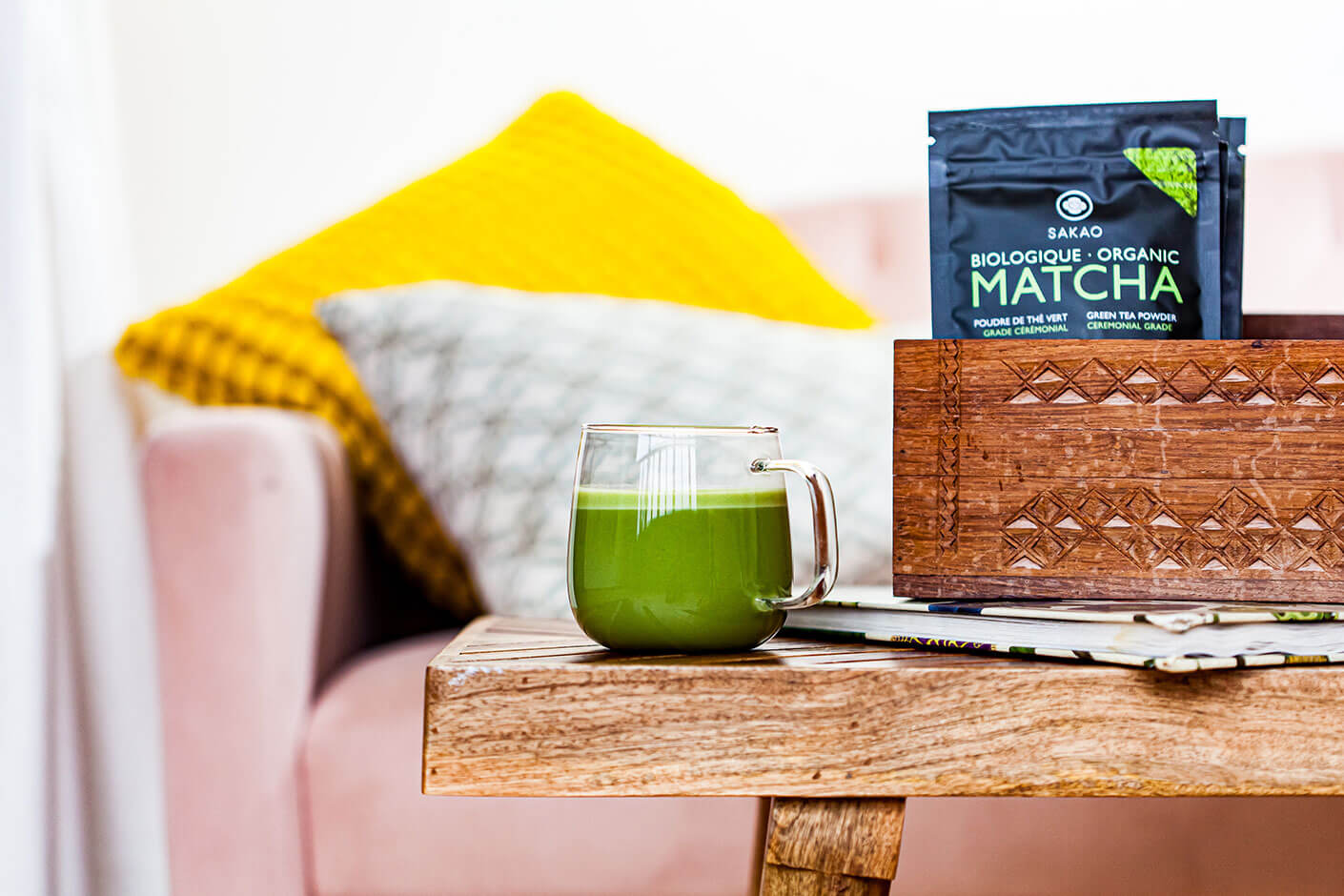
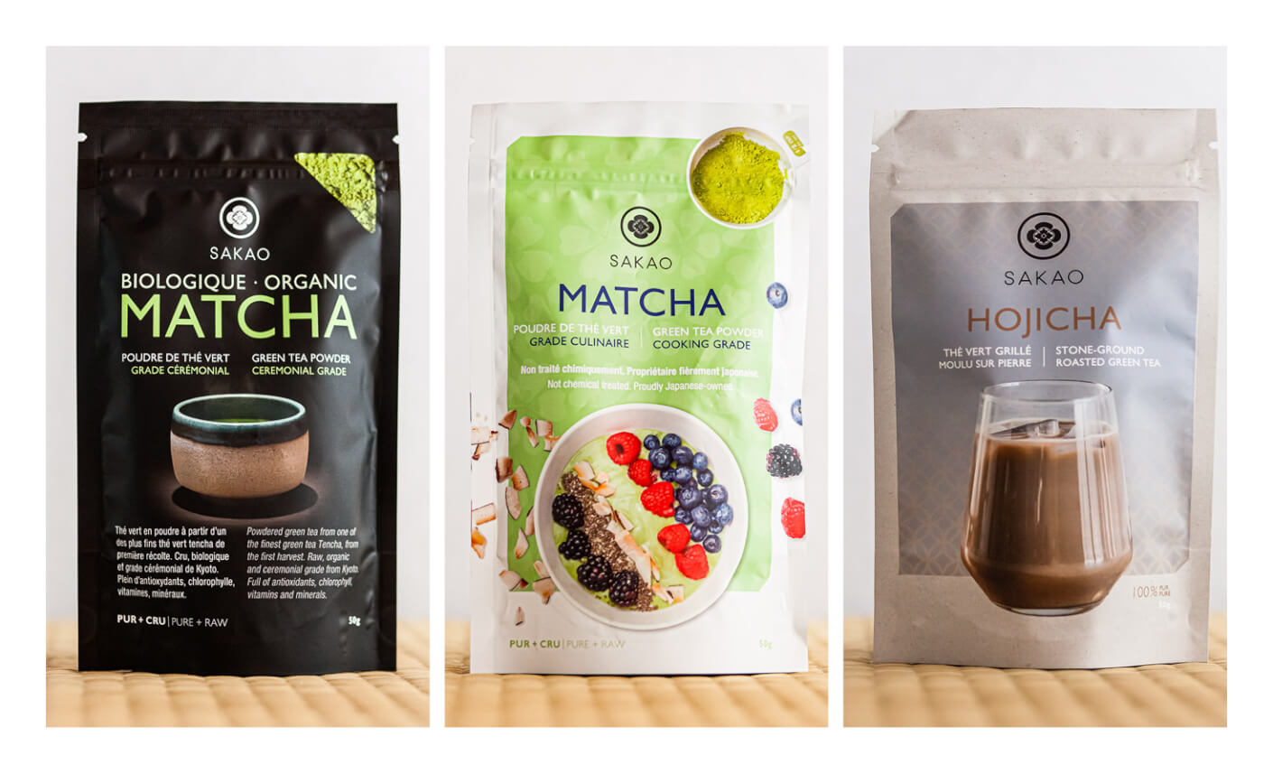
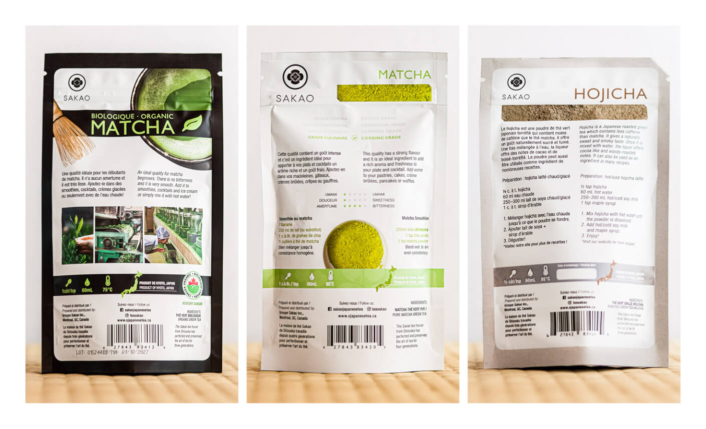
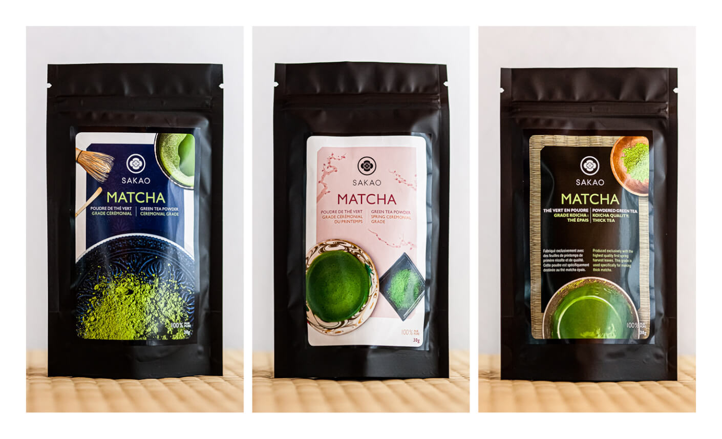
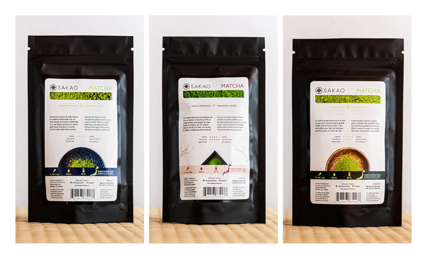
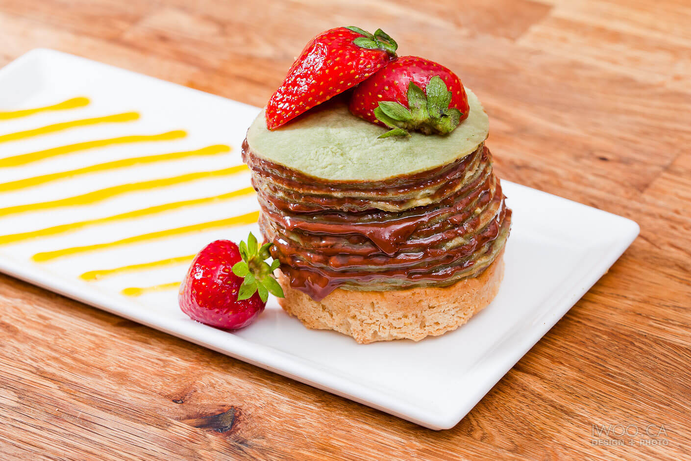
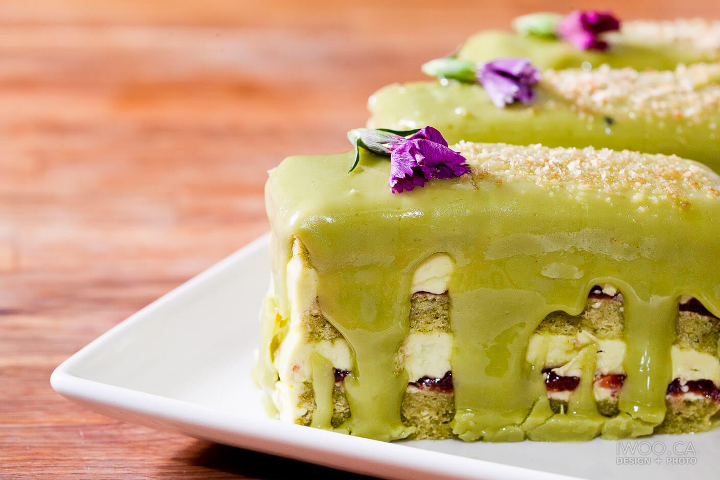
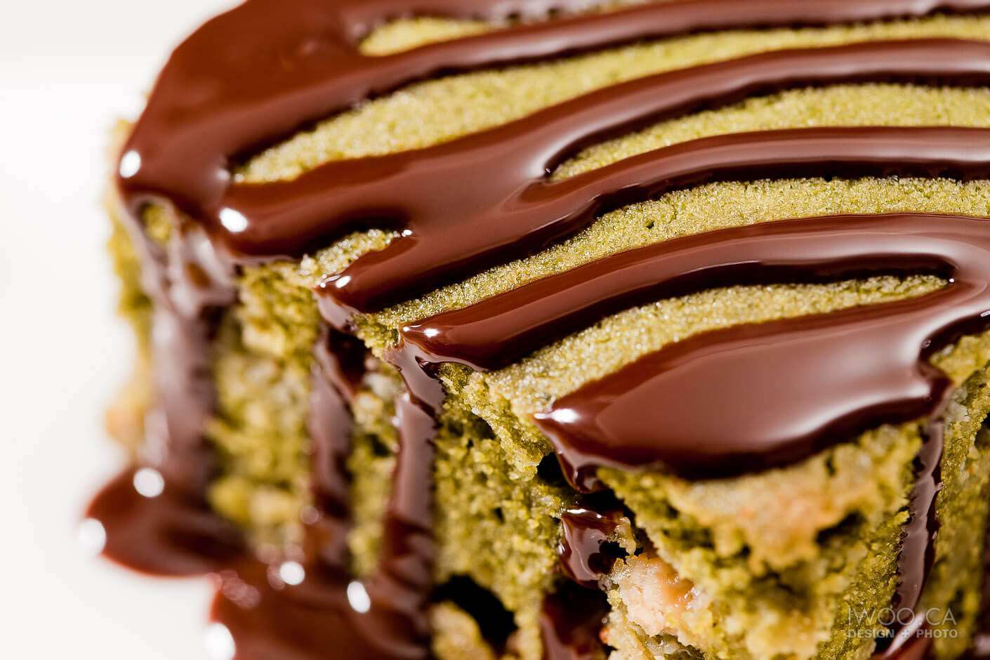
Photos et emballages pour Sakao; un entreprise du thé japonais, surtout le matcha (thé vert en poudre)

Photos and packages for Sakao, a Japanese tea company specializing in matcha (powdered green tea).

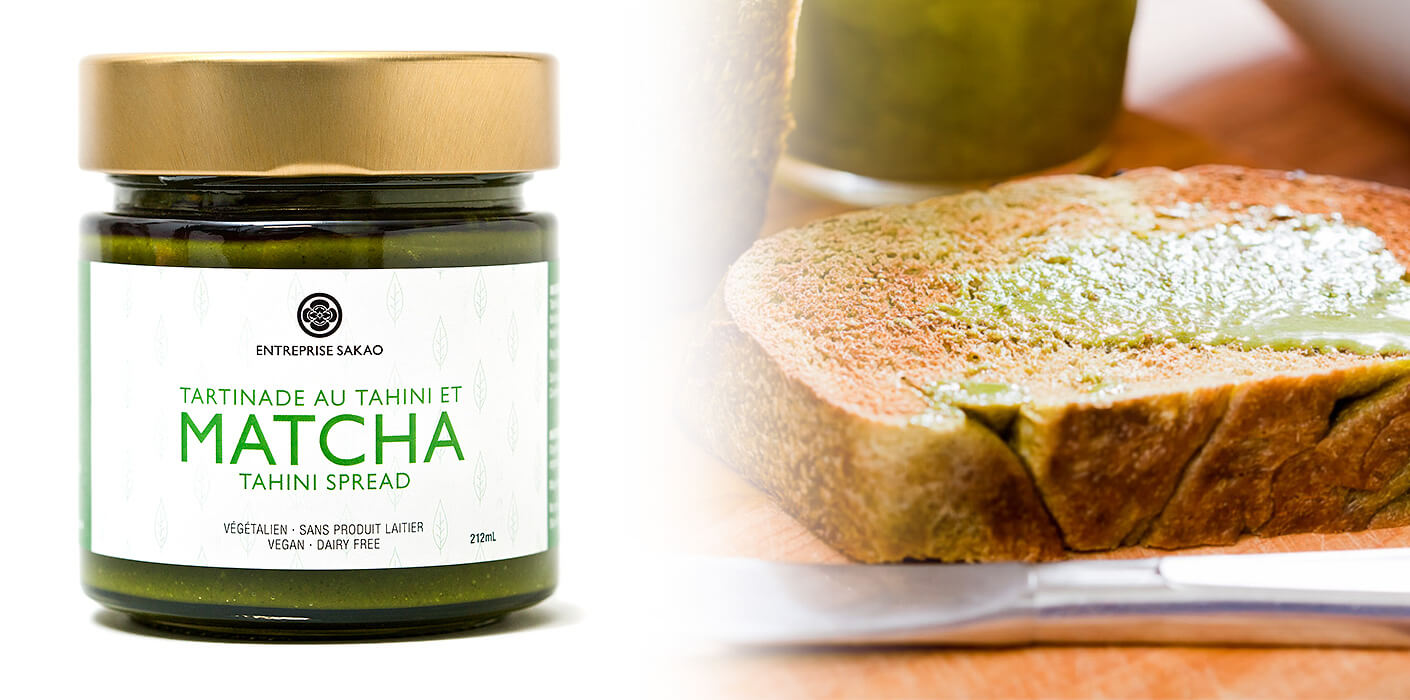
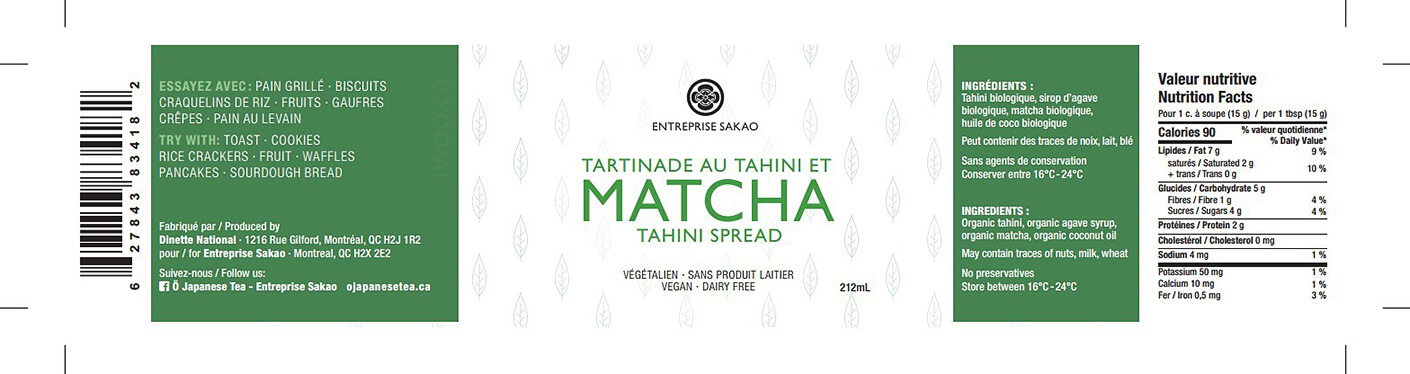
Étiquette pour une tartinade au matcha et tahini

Label for a matcha and tahini spread

Le Kioko Sushi

By Design, Print
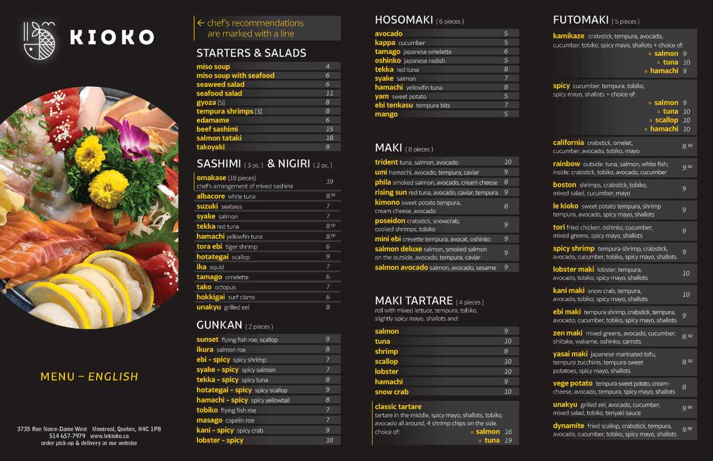
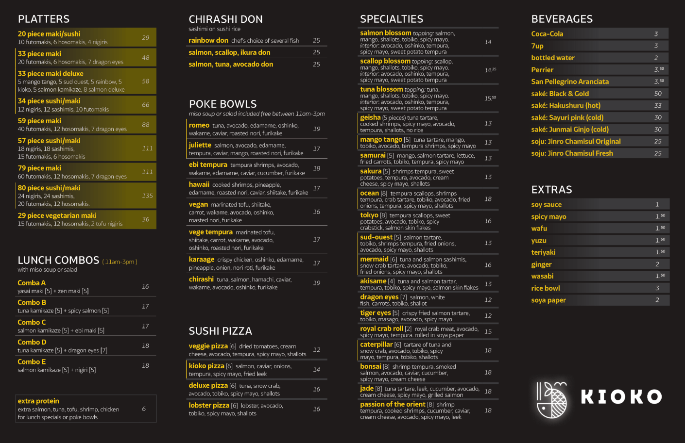
Menus pour Le Kioko, un restaurant de sushi et les bols pokés dans le St Henri.

Menus for Le Kioko, a sushi and poke bowl shop in St Henri.